Phacelle - Cheap Directional Noise
While working on a novel erosion algorithm last fall (which I'll release at a later time), I developed a directional noise function in the process, which combines various traits of other ones. I actually don't know if it's new or functional identical to some existing approach out there, but since I haven't come across one quite like this, I'll share my findings here anyway. I call it Phacelle Noise, a portmanteau of phase and cell.
I ended up making two versions, but let's start with Simple Phacelle Noise. For each point, it takes a 2D vector as input, which indicates the direction that stripes should be aligned with at that point. As output it produces another 2D vector from which a phase (or angle) can be reconstructed. Based on this phase, a wide variety of stripe shape profiles can be achieved, for example applying a square wave, a triangle wave, a sawtooth wave, or similar.
It's also possible to use the X or Y component of the output vector directly. These both produce stripes with a sine wave shape profile, a quarter cycle apart (so essentially a cosine and sine).
Even for use cases satisfied by sine wave based stripes, interpolating both cosine and sine waves simultaneously has a significant benefit. See, interpolating multiple kernels of sine waves normally produces a result where the amplitude of the output varies greatly depending on how in phase or out of phase the kernels are. However, when both the interpolated cosine and sine are available, the resulting output vector can be normalized, which ensures both the output sine and cosine waves have constant amplitudes of one.
The other version, Sampled Phacelle Noise, is very similar to Simple Phacelle Noise, except that instead of taking the input direction as an input parameter, it samples the input pattern once per cell, which amounts to 16 times per pixel. Before I go more into that, let's look at some pictures.
Visual comparison with Phasor Noise
With respect to use cases and functionality, the closest other noise function I know of is Phasor Noise (website, paper), itself a reformulation of Gabor Noise. But Phacelle Noise works in quite a different way, which appears to be much simpler and computationally cheaper, and produces a bit different results.
Here's a comparison of Phasor Noise (top) with Simple Phacelle Noise (middle) and Sampled Phacelle Noise (bottom):


To me eyes, these images above look remarkably similar, but there are subtle differences if you look closely. Specifically around areas in the pattern where there are discontinuities in the input direction.
To make the respective handling of discontinuities super obvious, let's use a different input pattern that alternates between horizontal and vertical directions in a checker pattern:


Here you can see that Simple Phacelle Noise has abrupt discontinuities in its generated stripe pattern, while Phasor Noise and Sampled Phacelle Noise does not. Ultimately it's a matter of personal preference, or use case, which one is preferable. For raw stripey patterns, the discontinuities in Simple Phacelle Noise are probably not desirable. For the erosion use case I worked on, it works well, since the stripe (gulley) pattern is masked out in those areas of discontinuities anyway.
The visual difference between Phasor Noise and Sampled Phacelle Noise is harder to put the finger on. It seems the latter has a bit higher tendency to produce broken lines rather than merged ones?
Performance
Performance-wise, both versions of Phacelle Noise are much simpler and cheaper than Phasor Noise. In Phasor Noise the innermost loop code (in their provided reference code) runs 5 * 5 * 16 = 400 times per pixel, and the input pattern is sampled in that inner loop, so 400 times per pixel as well. The primary author of the Phasor Noise paper Thibault Tricard pointed me to a corrected implementation by his colleague Xavier Chermain, which reduces the innermost loop count to 3 x 3 x 16 = 144 times per pixel.
On the other hand, innermost loop code in Phacelle Noise runs 4 * 4 = 16 times per pixel. The input pattern is sampled only once per pixel for Simple Phacelle Noise (where it's simply passed as an iput parameter) and 16 times per pixel (that is, one sample per loop) for Sampled Phacelle Noise.
| Noise | Loops per pixel | Samples per pixel |
|---|---|---|
| Phasor (Shadertoy by Thibault Tricard) | 400 |
400 |
| Phasor (Shadertoy by Xavier Chermain) | 144 |
144 |
| Simple Phacelle (Shadertoy) | 16 |
1 |
| Sampled Phacelle (Shadertoy) | 16 |
16 |
In practise I can also see that both Phacelle Shadertoys run many times faster than the Phasor Shadertoy (when switching them all to use a sample pattern which is not itself computationally heavy). I haven't done a more in-depth performance analysis since I don't have much experience profiling shaders, especially Shadertoys.
In Simple Phacelle Noise, the fact that the input pattern is sampled only once per pixel means that it can be passed to the Phacelle Noise function as a simple input parameter. With Phasor Noise (and to a lesser extent Sampled Phacelle Noise), storing the calculated input pattern in a buffer to avoid excessive recalculations is more or less a necessity (if it's not trivial), while no such buffer is needed with Simple Phacelle Noise. This also makes it easier to make the Simple Phacelle Noise implementation fully self-contained and reusable, since it does not need access to evaluate another function or buffer.
Function lineage
I didn't actually know of Phasor Noise when I implemented Phacelle Noise (the simple variant), and I felt very clever for coming up with the idea that by interpolating kernels of both cosine and sine waves simultaneously, the interpolated result can be interpreted as a vector that can be normalized, and from which a phase can be reconstructed.
Phacelle Noise is derived from a function called erosion in this 2018 Eroded Terrain Noise Shadertoy by user clayjohn. This function interpolates kernels of both cosine and sine waves, but the sine part is multiplied with a vector largely orthogonal to the stripe direction (but slightly different per kernel). Calculating both cosine and sine here has nothing to do with normalization or phase, but is rather done to get both a stripe pattern and its analytical derivative. The stripe pattern is used to carve gullies in a terrain based on the slope of the terrain, and the derivatives (the slope of the gullies) are used to further produce more gullies, branching out in a fractal manner.
In 2023, user Fewes made a refined presentation of clayjohn's erosion technique in this Terrain Erosion Noise Shadertoy. While the core technique was kept mostly the same, Fewes did simplify the vector multiplied onto the sine component of each kernel, making it the same for all the kernels.
My own erosion work in 2025 was based on Fewes' version as a starting point. The sine component being premultiplied with a vector makes normalization and phase extraction less straightforward. It's nevertheless what I did initially, since my use case was erosion too, and I needed the derivatives. However, I eventually realized that there's no need for the direction vector to be premultiplied onto each kernel, as multiplying it onto the interpolated result is fully equivalent. This makes it easy to get the best of both worlds, both clean interpolated cosine and sine waves, and a simple way to get the derivatives too.
Digging further back, clayjohn's erosion function was derived from a function called gavoronoi4 is this Gavoronoise Shadertoy by user guil. This function produces stripes by interpolating kernels of cosine only, and the stripe direction is global rather than variable per pixel.
In turn, Gavoronoise Noise was inspired by Gabor and Voronoi Noise. Gabor Noise because it interpolates stripes produced by sine waves, and Voronoi Noise - specifically this Voronoi Shadertoy by user iq is quoted as a source - because it interpolates a "moving window" of cells, such that an infinite pattern of cells can be achieved while sampling only a finite number of cells at a time (typically 3 x 3, 4 x 4, or 5 x 5).
Readability
Like I said at the start, I don't actually know if my function is new, or a near-identical implementation already exists out there. I don't know every noise function and every Shadertoy. If anyone reading this know of existing directional noise implementations that are similar to this one (low number of inner loop iterations, phase based output), please let me know!
But I bet that even if my version is nothing new, my implementation is most likely still easier to read and understand.
See, most Shadertoys read to me as if the authors thought they were in an obfuscation contest. Variables are commonly one or two letters long, and it's your lucky day if there's even just a word or two of comments. This makes a lot of this code opaque to me. It's cumbersome having to reverse engineer what each variable means, and I'll have forgotten what the first one means once I'm done figuring out the third one.
It's here that I'll admit I don't actually understand how Phasor Noise works, despite having stared at the code for it for some time. I came away with certain conclusions (like the number of iterations and input pattern samples), but far from a full picture. I don't know what the innermost loop actually does.
Some of this culture of compact, non-verbose variable names might inherit from traditions in mathematical notation, where every variable is a single letter or symbol only, which similarly makes mathematical formulas (a frequent occurance in papers about graphics) often appear opaque to me. It's here that I'll admit I also read the paper on Phasor Noise, but that didn't help me understand it either. I mean, I understand the phase part perfectly, but not the part about how exactly kernels are computed and interpolated, and what those 400 inner loop iterations are needed for.
Mathematical notation is tricky to reform away from single-letter variables (even if there was willingness), since sequences of letters right after each other are interpreted as variables being multiplied. Except when they're not, as in sin, cos, and a host of other function names that are somehow allowed to be multi-letter by convention.
But the way I see it, with code there's no excuse not to make it as readable as possible without the reader having to resort to guesswork and reverse engineering.
So in my own Shadertoys I try to use as descriptive variable names I can, and I strive to add plenty of comments. And in that way, I hope my implementation of Phacelle Noise will be helpful to some people out there, whether or not the technique is actually novel.
- My Simple Phacelle Noise Profile Shadertoy.
- My Sampled Phacelle Noise Profile Shadertoy.
- The original Procedural Phasor Noise Profile Shadertoy by the Phasor Noise authors.
- My forked Phasor Noise Profile Shadertoy, which has additional sample patterns, such as the checker one.
Related Shadertoys I'm aware of:
- Gabor/Phasor flow Shadertoy by Fabrice Neyret (Phasor co-author)
- Gabor 4: normalized Shadertoy by Fabrice Neyret (Phasor co-author)
- Phasor noise Shadertoy by Xavier Chermain (a colleague of Phasor author Thibault Tricard) which corrected some mistakes in the original Phasor Shadertoys.
I made a hair shader
I've actually been working on a cool erosion technique I'll post about later, but during some downtime, I had an impulse to see if I could make a basic hair shader that doesn't require any specially made meshes or textures. I ended up making three hair shaders.
The shapes below are just standard Unity spheres and capsules and only a simple normal map is used; no other textures. The hair strands follow the vertical V direction of the UV map of the mesh.
I also found some characters on the Asset Store and tried changing the hair material to use my shader. Luckily they all already had hair aligned vertically in the UV map (although not 100% for wavy/curly hair, which compromises my shader slightly).
You can see a video here with the shader in action on both basic shapes and characters:
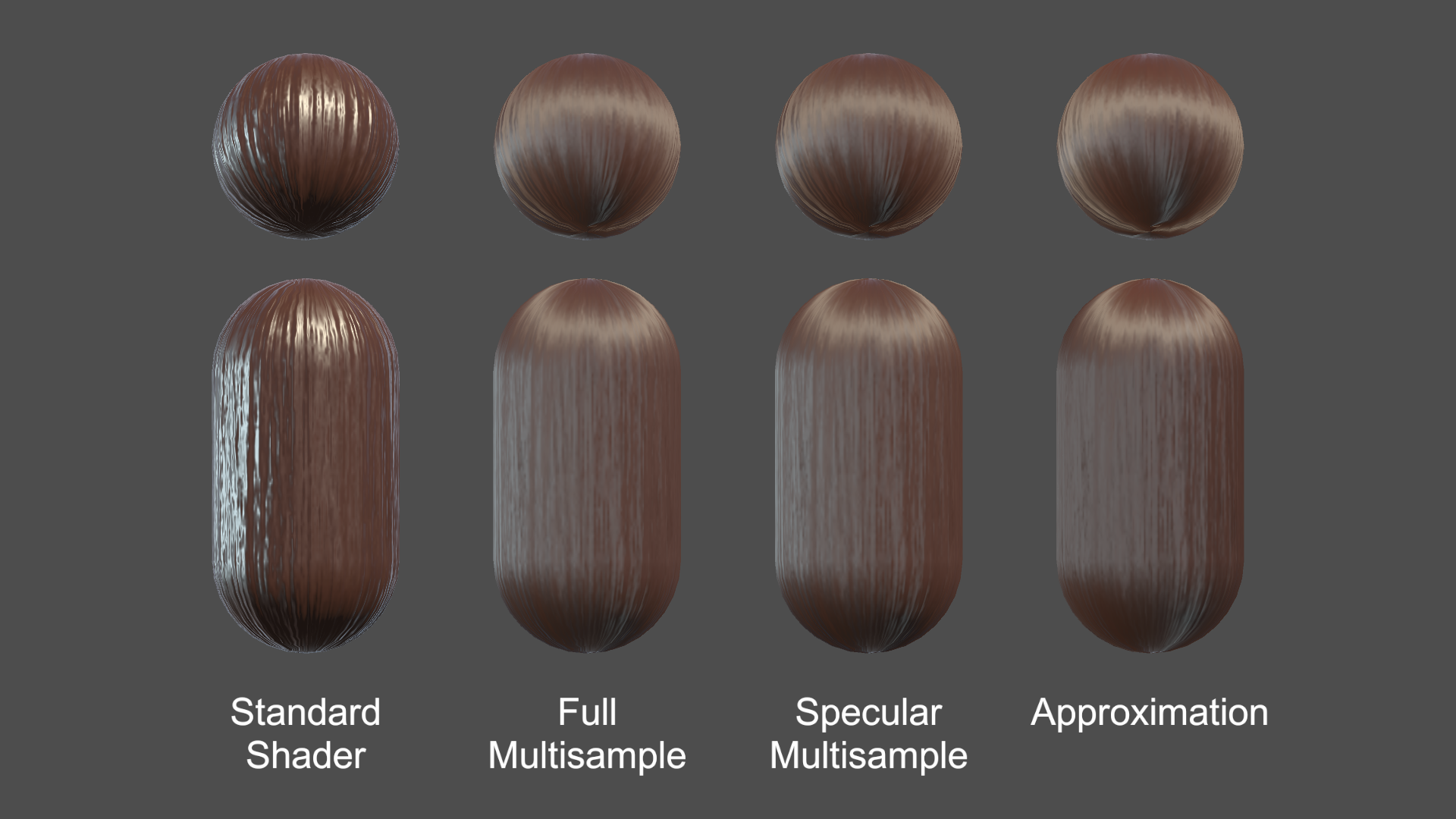
I ended up making these three hair shader implementations:
- Full multisample hair shader
- Specular multisample hair shader
- Approximation hair shader
All three shaders support a diffuse map, a normal map, and properties for color, smoothness, and normal map strength. The diffuse map alpha is used for cutout transparency.
See the hair shader repository on GitHub
The strategy was to start with Unity's Standard shading model (based on BRDF physically based shading), but modify it to simulate anisotropic shading, that is, to simulate that the surface is made from lots of little parallel cylinders rather than a flat surface.
This approach ensures that the hair shader looks consistent with other materials based on Unity's Standard shader (and other Surface shaders) under a wide variety of lighting conditions and environments.
1) Full Multisample Hair Shader
I started out doing brute force anisotropic shading, running the Unity's physically based BRDF shading function up to 50 times and taking a weighted average of the sample colors.
The normals in those samples are spread out in a 180 degree fan of directions centered around the original normal, using the hair strand direction as the axis of rotation. The final color is a weighted average of the samples.
Much of the "magic" of the simulated anisotropic shading comes from the way the samples are weighted in the two multisample shaders (and emulated in the third).
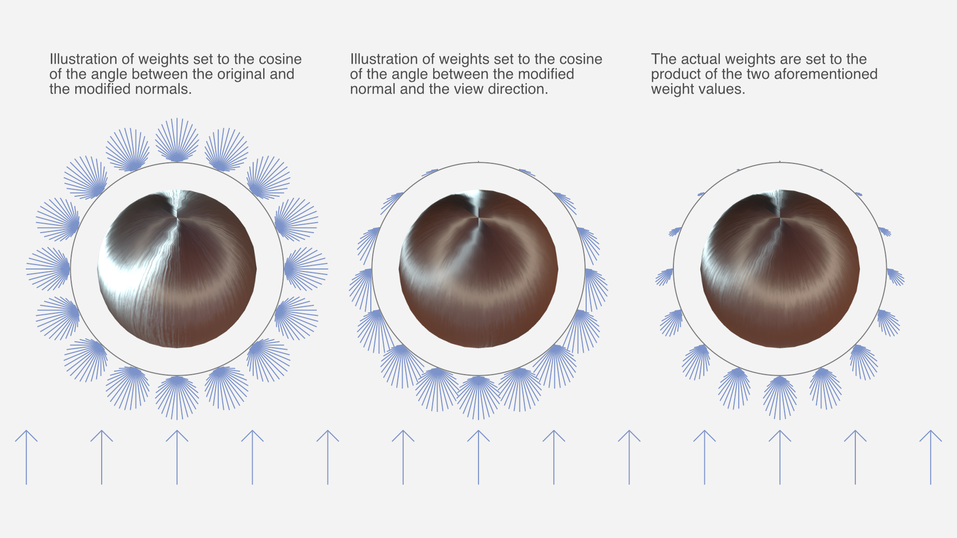
The weight of each sample is a product of two functions:
- The cosine of the angle between the original and modified normal. This is because strands of hair occlude other strands of hair when the hair "surface" is seen from the side, and the parts of strands that face outward tend to be less occluded.
- The cosine of the angle between the modified normal and the view direction. This is because the part of the strand that's facing the camera takes up more of the view than parts that are seen at an angle.
Both cosines are clamped to a zero-to-one range before the two are multiplied.
With this weight function to base the weighted average on, the results looked surprisingly good. Of course, running the entire shading up to 50 times is not exactly the fastest approach, performance-wise.
2) Specular Multisample Hair Shader
I made a second implementation that reduces computations somewhat by only multi-sampling certain calculations, namely dot products with the normal, and most of the specular term of the lighting. The diffuse term, fresnel, and other calculations are performed only once. The result is nearly indistinguishable from the full multisample hair shader.
There is still a significant amount of calculations being performed up to 50 times though.
3) Approximation Hair Shader
Of course, non-brute force approaches to hair shading are possible too, but way harder to make look good. Still, I eventually came up with something fairly decent.
The third implementation does not perform multisampling but instead emulates the same result. The math formulas required for this were devised by means of a combination of partial understanding, intuition, and trial and error, while carefully comparing the results with the full multisample hair shader. As such, it's difficult to explain the details of the logic behind it with any exactness, but you can see the details in the shader source code.
Closing thoughts
This was just a little experiment I did as a random side project. I haven't looked much at existing research on hair shaders, as I tend to not understand graphics papers very well. My impression is that this has less to do with the subject matter itself, and more to do with the manner in which it's explained.
The one research entry I did look at – Hair Rendering and Shading by Thorsten Scheuermann – only shows the results on a complex multi-layered haircut model; not simple spheres like I used for testing, which makes it impossible to compare results meaningfully.
I'm not planning any further work on the hair shaders, but I've released them as open source on GitHub. If anyone makes changes or improvements to them – or just use them in a project – I'd love to hear about it.
Notes on atmospheric perspective and distant mountains
I don't know if it's because I come from a supremely flat country, or in spite of it, but I love terrain with elevation differences. Seeing cliffs or mountains in the distance fills me with a special kind of calm. The game I'm currently working on, The Big Forest, is full of mountain forests too.
I've just returned from three weeks of vacation in Japan, and I had ample opportunities to admire and study views with layers upon layers of mountains in the distance. And while studying these views, something about the shades of mountains at different distances clicked for me that’s now obvious in retrospect. I'll get back to that.
Note: No photos here have any post-processing applied, apart from what light processing an iPhone 13 mini does out of the box with default settings. I often looked at the photos right after taking them, and they looked pretty faithful to what I could see with my own eyes.


The blue tint of atmospheric perspective
A beautiful thing about mountains in the far distance is how they appear as colored shapes behind each other in various shades of blue. Sometimes it looks distinctly like a watercolor painting.

In an art context, the blue tint that increases with distance is called aerial perspective or atmospheric perspective (Wikipedia).
I've tried to capture this in The Big Forest too by making things more blue tinted in the distance. In terms of 3D graphics techniques, I implemented it by using the simple fog feature which is built into Unity and most other engines. By setting the fog color to blue, everything fades towards blue in the distance. It can produce a more or less convincing aerial perspective effect. Using fog for this purpose is as old as the fog feature itself. The original OpenGL documentation mentions that the fog feature using the exponential mode "can be used to represent a number of atmospheric effects", implying it's not only for simulating fog. For our purposes, let's call it the fog trick.

Which color does things fade towards?
I long held a misconception that things in the distance (like mountains) get tinted towards whatever color the sky behind them has. In daytime when the sky is blue, the color of mountains approach the same blue color the further away they are. At sunset where the sky is red, the mountains approach that red color too. A hazy day where the sky is white? The mountains fade towards white too.
Of course, the sky is not a single color at a time. Even at its blueest, it's usually more pale at the horizon than straight above.
This raises a dilemma when using the fog trick. Set the fog color too close to the blue sky above, and the distant mountains appear unnatural near the pale horizon. But set the fog color to the pale color of the sky at the horizon, and the result is even worse: Some mountain peaks may then end up looking paler than the sky right behind them, and that looks very bad, since it never happens in reality.

For a long time I wished Unity had a way to fade towards the skybox color (the color of the sky at a given pixel) rather than a single fixed color.
In practice, it's not too difficult to settle on a compromise color which looks mostly fine. It's just still not ideal, for reasons that will become clear later.
Are more distant mountains more pale?
Now, while I was tweaking the fog color in my game and in general contemplating atmospheric perspective, I could see from certain reference photos I'd found on the Internet that mountains look paler at great distances. Not just paler than their native color – green if covered in trees – but also paler than the deep blue tint they appear with at less extreme distances.
This was counter-intuitive. How could the atmosphere tint things increasingly saturated blue up to a certain distance, but less saturated again beyond that point? Now, the thing is, you never know how random reference photos have been processed, and which filters might have been applied. For a while, I thought it simply came down to tone mapping.
Tone mapping is a technique used in digital photography and computer graphics to map very high contrasts observed in the real world (referred to as high dynamic range) into lower contrasts representable in a regular photograph or image (low dynamic range). For context, the sky can easily be a hundred times brighter than something on the ground that's in shadow. Our eyes are good at perceiving both despite the extreme difference in brightness, but a photograph or conventional digital image cannot represent one thing that's a hundred times brighter than another without losing most detail in one or the other.
If you try to take a picture with both sky and ground, the sky may appear white in the photo even though it looked blue to your eyes. Or if the sky appears as blue in the photo as it did to your eyes, then the ground may appear black. Tone mapping makes it possible to achieve a compromise: The ground can be legible while the sky also appears blue, but it's a paler blue in the photo than it appeared to your eyes. Tone mapping typically turns non-representable brightness into paleness instead.
So I thought: Distant mountains approach the color – and brightness – of the sky, so they may appear increasingly pale in photos simply because they're increasingly bright in reality, and the brightness gets turned into paleness by tone mapping.
However, while observing distant mountains with my own eyes on the Japan trip, it became clear that this theory just doesn't hold up.
Revised theory
Some of my thinking was partially true. Distant mountains do take on the color of the sky, just in a bit different way than I thought. And tone mapping does sometimes affect the paleness of the sky and distant mountains.
But on this trip I had ample opportunity to study mountains layered at many distances behind each other. I could observe with my own eyes (no tone mapping involved) that they do get paler with distance. (It's not that I've never seen mountains in the distance with my own eyes before, but on previous occasions I guess I didn't think very analytically about the exact shades.) Furthermore I've taken a lot of pictures of it, where (unlike random pictures I find on the Internet) I've verified that the colors and shades look about the same in the pictures as they looked to my eyes in real life.

So here's what finally clicked for me:
Mountains transition from a deep blue tint in the mid-distance to a paler tint in the far distance for the same reason that the sky is paler near the horizon.
To the best of my current understanding, the complex scientific reason relates to how Rayleigh scattering (Wikipedia) and possibly Mie scattering (Wikipedia) interact with sunlight and the human visual system, but the end result is this:
As you look through an increasing distance of air (in daytime), the appearance of the air changes from transparent, to blue, to nearly white. (Presumably this goes through a curved trajectory in color space).
- When you look at the sky, there's more air to look through near the horizon than when looking straight up, so the horizon is paler.
- Similarly, there's also more air to look through when looking at a more distant mountain compared to a less distant one, so the more distant one is paler.
A small corollary to this is that the atmospheric tint of a mountain can only ever be less pale than the sky immediately behind it, since you're always looking through a greater distance of air when looking just past the mountain than when looking directly at it.
This can be generalized, so it doesn't only work at daytime, but for sunsets too: Closer mountains are tinted similar to the sky further up, while more distant mountains are tinted similar to the sky nearer the horizon. In practice though, it's hard to find photos showing red-tinted mountains; much more common are blue-tinted mountains flush against the red horizon. Possibly the shadows from the mountains at sunset play a role, or perhaps the distance required for a red tint is so large that mountains are almost never far enough away.
I sort of knew the part about the horizon being paler due to looking through more air, but for some reason hadn't connected it to mountains at different distances. In retrospect it's obvious to me, and I'm sure lots of the readership of this blog were well aware of it, and find it amusing that I only found out about it now. On the other hand, I can also see why it eluded me for a long time:
- It's just not intuitive that a single effect fades things towards one color or another depending on the magnitude.
- It's hard to find good and reliable reference photos, and unclear how to interpret them given the existence of filters and tone mapping.
- The Wikipedia page on aerial perspective doesn't mention that the color goes from deeper blue to paler blue with distance. You could read the entire page and just come away with the same idea I had, that aerial perspective simply fades towards one color.
- If you go deeper and read the Wikipedia pages on Rayleigh scattering and Mie scattering, they don't mention it either. The one on Rayleigh scattering has a section about "Cause of the blue color of the sky", but it doesn't mention anything about the horizon being paler.
In fact, I've not yet found any resource that is explicit about the fact that the color of increasingly distant mountains go from deeper blue to paler blue. It's even hard to find any references that explain why the sky is paler near the horizon, and the random obscure Reddit and Stack Exchange posts I did find did not agree on whether the paleness of the horizon is due to Rayleigh scattering or to Mie scattering.
I found and tinkered with this Shadertoy, and if that's anything to go by, the pale horizon comes from Rayleigh scattering, while Mie scattering primarily produces a halo around the sun. I don't know how to add mountains to it though.
All right, that was a lot of text. Here's another nice photo to look at:

I'm still not really certain of much, and you should take my conclusions with a grain of salt. I haven't yet found any definitive validation of my theory that mountains are paler with distance for the same reason the horizon is paler; it's just my best explanation based on my observations so far. I find it somewhat strange that it's so difficult to find good and straightforward information on this topic (at least for people who are not expert graphics programmers or academics), but perhaps some knowledgeable readers of this post can shed additional light on things.
One thing is pretty clear: An accurate rendition of atmospheric perspective (at great distances) cannot be achieved in games and other computer graphics by using the fog trick, or other approaches that fade towards a single color. I haven't yet researched alternatives much, but I'm sure there must be a variety of off-the-shelf solutions for Unity and other engines. I've learned that Unreal has a powerful and versatile Sky Atmosphere Component built-in, while Unity's HD render pipeline has a Physically Based Sky feature, which however seems problematic according to various forum threads. If you have experience with any atmospheric scattering solutions, feel free to tell about your experience in the comments below.
It's also worth noting though that the distances at which mountains fade from the deepest blue to paler blue colors can be quite extreme, and may not be relevant at all for a lot of games. Plenty of games have shipped and looked great using the fog trick, despite its limitations.
Light and shadow
Let's finally move on from the subject of paleness, and look at how light and shadow interacts with atmospheric perspective.
Here are two pictures of the same mountains (the big one is the volcano Mount Iwate) from almost the same angle, at two different times. In the first, where the mountain sides facing the camera are in shadow, the mountains appear as flat colors. In the second you can see spots of snow and other details on the volcano, lit by the sun. The color of the atmosphere is also a deeper blue in the second picture, probably due to being closer to midday.


And here's a picture from Yama-dera (Risshaku-ji temple), where the partial cloud cover lets us see mountains in both sunlight and shadow simultaneously. This makes it very clear that mountain sides at the same distance appear blue when in shadow and green when in light. The blue color of the atmosphere is of course still there in the sunlit parts of the surface, but it's owerpowered by the stronger green light from the sunlit trees.

That's all the observations on atmospheric perspective I made for now. I would love to hear your thoughts and insights! If you'd like to see more inspiring photos from my Japan trip (for example from a mystical forest stairway), I wrote another post about that.
Resources for further study
Here are links to some resources I and others have come across while looking into this topic.
From my perspective, these resources are mostly to get a better understanding of the subject, and the theoretical possibilities. In practice, it's not straightforward to implement one's own atmospheric scattering solution in an existing engine. Even in cases where the math itself is simple enough, the graphics pipeline plumbing required to make the effect apply to all materials (opaque and transparent) is often non-trivial or outright prohibitive for people like me, who aren't expert graphics programmers.
- A simple improvement upon single-color fog is to use different exponents for the red, green, and blue channel. This can be used to have the tint of the atmosphere shift from blue to white with distance. There's example shader code for it in this post by Inigo Quilez, though unfortunately it lacks images illustrating the effect. The post also covers how to fade towards a different color near the sun, and other effects.
- Here's a 2020 academic paper, video and code repository for the atmospheric rendering in Unreal, and here's the documentation.
- Here's the documentation for Unity's Physically Based Sky.
- A 2008 paper that gets referenced a lot is Precomputed Atmospheric Scattering by Bruneton and Neyret, with code repository here. Unity's solution is based on it, and it's cited and compared in Unreal's paper.
Photos from an inspiring trip in Japan
I've just returned from three weeks of vacation in Japan. Besides being great as a vacation – which was the only thing my partner and I planned for, really – it happened to also be inspiring for me as a game developer. I like to make games that take place at least partially in beautiful nature, give a sense of mystery and wonder that invites exploration, and that have environments that incorporate strong verticality. And in all of these respects, Japan delivers in spades.

Procedural creature progress 2021 - 2024
For my game The Big Forest I want to have creatures that are both procedurally generated and animated, which, as expected, is quite a research challenge.
As mentioned in my 2024 retrospective, I spent the last six months of 2024 working on this – three months on procedural model generation and three months on procedural animation. My work on the creatures actually started earlier though. According to my commit history, I started in 2021 after shipping Eye of the Temple for PCVR, though my work on it prior to 2024 was sporadic.
Though the creatures are still very far from where they need to be, I'll write a bit here about my progress so far.
The goal
I need lots of forest creatures for the gameplay of The Big Forest, some of which will revolve around identifying specific creatures to use for various unique purposes. I prototyped the gameplay using simple sprites for creatures, but the final game requires creatures that are fully 3D and fit well within the game's forest terrain.

2024 retrospective
Another year went by as an indie game developer and what do I have to show for it?
In last year's retrospective I wrote that apart from working on my game The Big Forest in general, I had four concrete goals for 2024:
- Present my Fractal Dithering technique
- Release my Layer-Based ProcGen for Infinite Worlds framework as open source
- Wrap up and release The Cluster as a free experimental game
- Make better use of my YouTube channel
I ended up doing only two of those, but it was the two most important ones to me, so I'm feeling all right with that.
Release of LayerProcGen as open source
I released my LayerProcGen framework as open source in May 2024. LayerProcGen is a framework that can be used to implement layer-based procedural generation that's infinite, deterministic and contextual.

I wrote extensive documentation describing not only the specifics of how to use it, but also the overarching ideas and principles it's based on. I also did a talk at Everything Procedural Conference about it, which was well received.
Procedural game progression dependency graphs
In 2022 I came up with some new ideas for what kind of game The Big Forest (working title) could be. During the year, I developed a way to procedurally create dependency graphs and also procedurally create fully playable game levels based on the graphs.

The Cluster is now released
The Cluster is finally released and available for free on Itch. It's a 2.5D exploration platformer set in an open world that's carefully procedurally planned and generated, and does a few interesting things I haven't yet seen in other games (check out the links for more info).

Here's a trailer:
My last blog post about The Cluster was in 2016 and titled "Development of The Cluster put on hold", and by that I meant put on hold indefinitely.
2023 retrospective and goals for the new year
2023 was a pretty good year for me!
I'll touch here briefly on my personal life, then go on to talk about the Quest 2 release and sales of Eye of the Temple, and finally talk about my new game project and goals for 2024.
Personal life
It's the first year since the pandemic that didn't feel affected by it. I moved from Denmark to Finland in 2020, just as the pandemic began, so on the social side it was some slow years initially.
Things picked up in 2022, but especially in 2023 we had lots of family and friends from Denmark visit us here and have a great time, and we also made more strides on the local social network front.
Particularly memorable was a wonderful weekend celebrating the 40th birthdays of me and a friend, with some of my closest family and friends from Denmark and Finland at a site called Herrankukkaro in the beautiful Finnish archipelago.
Eye of the Temple released on Quest and turned a profit
In April 2023, a year and a half after the original PC release on Steam, my VR game Eye of the Temple was finally released for Quest 2, with the help of Salmi Games. While it was super tough getting there, in the end we managed to ship the game at a level of quality I'm very proud of. Others agreed; it got a great critical reception, as well as a high user rating of 4.7 out of 5 stars.
It's super gratifying regularly seeing new reviews of the game from people who say it's the best VR experience they've had. Oh, and recently, UploadVR ranked it the 5th best game for Quest 3 and Screen Rant ranked it the 6th best game for Quest 2. Wow, what an achievement for my little game! (But remember, critical acclaim does not equal sales…)
I’m no longer working on the game at this point. After being occupied with it over a span of seven years, I really want to move on, and I'm also done with VR in general for now. But the sales of the game are still developing, so let's talk a bit about that.
My thinking about the game’s sales performance has changed a lot over time. I didn't pay myself a regular salary during the game’s three years of full time work. But when evaluating the game financially, I use the old salary from my previous job as reference, and calculate whether my time investment at that salary (I’ll refer to it as just “my investment”) would be covered retroactively by the game’s revenue. Of course, I also keep in mind that the covered percentage would be higher if I based it on a more moderate salary.
I was initially slightly disappointed in the Steam sales. As I wrote about back in November 2021, the projected year one sales would only cover 25% of my investment. Back then I expected the Steam year one revenue to make up the majority of the game's lifetime revenue. One year later, the sales had outperformed that projection, and my investment was actually covered 40%.
A lot has happened since then, in particular due to the Quest launch.
Comments from many VR developers in 2021 and 2022 had indicated that Quest sales could commonly be 5x-10x as large as Steam VR sales. For Eye of the Temple, the Quest week one revenue was merely twice of what the Steam week one revenue had been, so it was not quite as high as Salmi Games and I had hoped for. Speaking with other VR developers in 2023, it seems that the time when Eye of the Temple launched on Quest was generally a bad period for Quest game sales.
Still, Quest is easily the most important VR platform, and later the sales picked up significantly, with the recent Black Friday and Xmas sales combined having as big an impact on revenue as the launch sales. Already, 70% of total revenue has come from Quest and 30% from Steam, with the Quest version having been out for a shorter time.

My investment is now covered 140%. In other words, even based on a proper salary for myself that's fitting for my experience, Eye of the Temple has recently flipped well into profitability. That still doesn't make it a runaway hit, but it's really nice to know that it's a success not only creatively and as a passion project, but also in terms of financial sustainability. Back in 2020 when I was still developing the game, I had not expected that at all for my first commercial title.
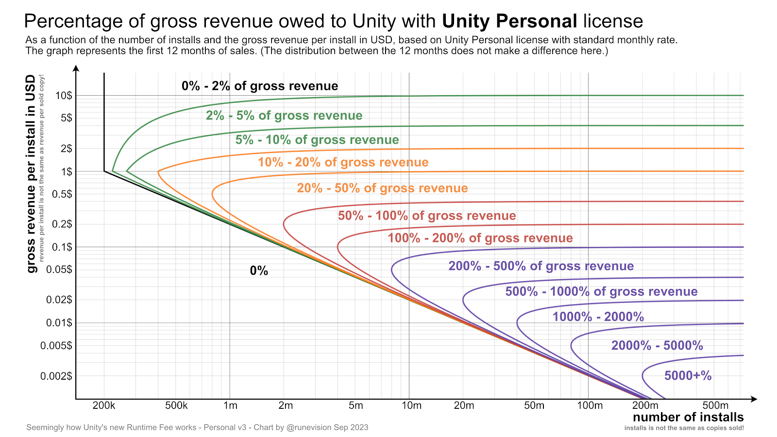
Charts to visualize how much you owe Unity for their per-install Runtime Fee
Unity Technologies has announced a new Unity Runtime Fee that charges developers a fee of up to $0.20 per installed game above certain thresholds. According to my calculations, it can be a bankruptcy death-trap, at least in certain cases.
Shockingly, the owed percentage is unbounded to the point that the owed amount can exceed gross revenue, since it depends on installs, not sales.
Update 1: Unity since backtracked and apologized for the announced changes. With the new updates to the terms, Unity will clamp the install fees to be at maximum 2.5% of revenue. And the changes will not be retroactive after all. Furthermore, John Riccotello is stepping down as CEO. There are more details in the linked blog post.
Update 2: About a year later, Unity canceled the runtime fee altogether. Good.
Nevertheless, Unity has suffered a tremendous decrease in trust and goodwill, which already was not great before. With the cancellation, there is less urgency for developers to switch to a different engine, but the whole situation has highlghted the importance of being prepared for such a scenario and have eyes and ears open towards other engines as well.
The original post continues below.
You can check out the specifications in their blog post. Based on those, I've made two charts where you can look up how big a percentage of your gross revenue you would owe Unity, based on the number of installs and on how much revenue you make for each of those installs. The fee specifications are different for Unity Personal and Unity Pro, so there is a chart for each.