Behind the design of Eye of the Temple
My VR adventure Eye of the Temple, that I've been working on since 2016, has landed on the Meta Quest 2! It was released last week on April 27th.
Get Eye of the Temple for Quest 2 on the Oculus Store
Originally released for SteamVR in October 2021, so many people have asked for it to be brought to the Quest 2 as a native app, so I'm happy it's finally a reality. The Quest 2 version was co-developed with Salmi Games and it took all our combined and complimentary skills to bring the game to life at target framerate on the Quest 2 mobile hardware.
We also made this new trailer:
The game got a fantastic reception! UploadVR called it "A Triumphant Room-Scale Adventure" and has labeled it an essential VR experience, and it got great video coverage by Beardo Benjo, BMFVR and many others. It also got great user reviews and a high review score on the Oculus Store.
Behind the design
To mark the Quest 2 launch of Eye of the Temple, I've written no less than three articles - published elsewhere - about different aspects of its design.
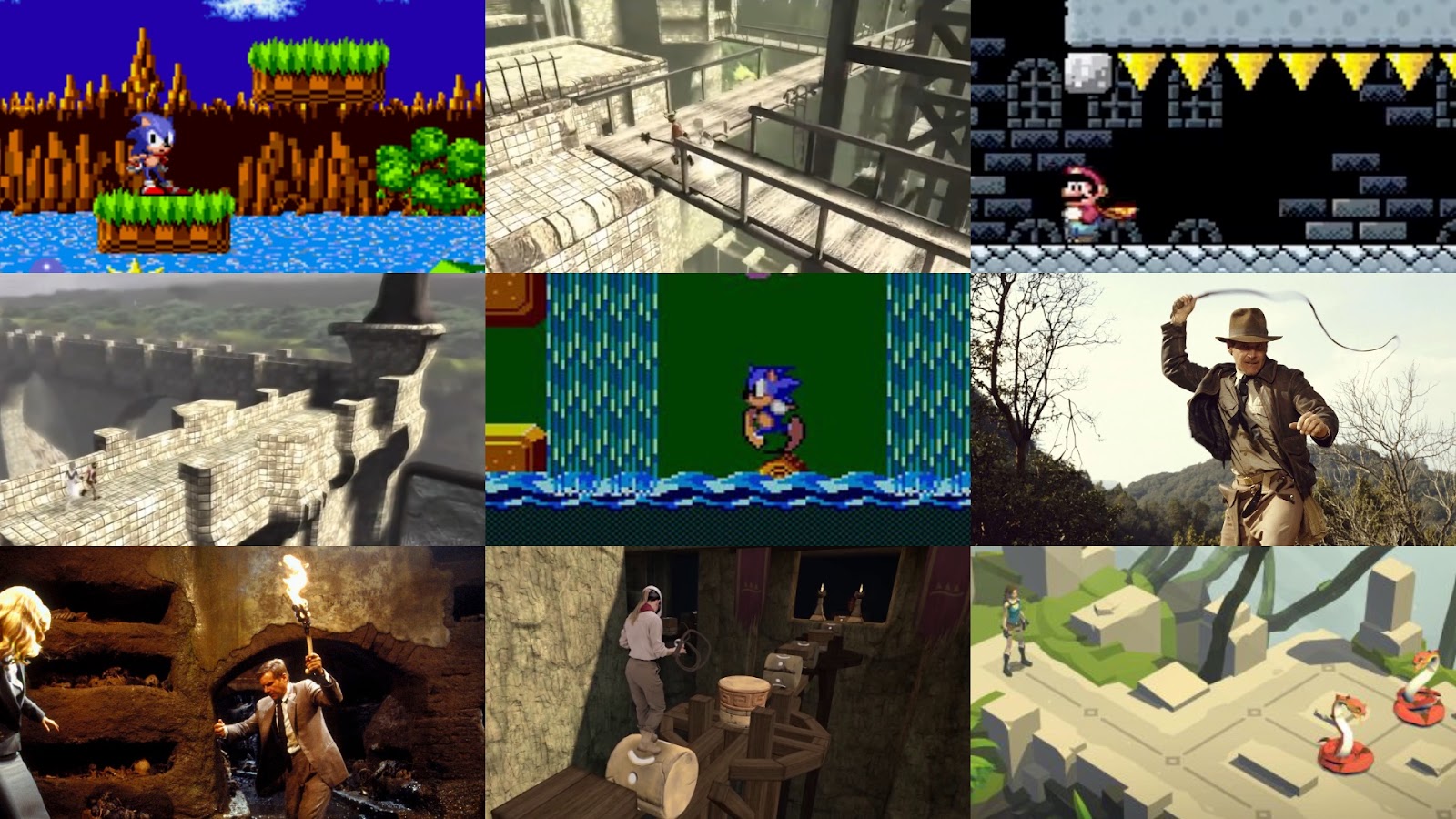
The Origins and Inspirations of ‘Eye of the Temple’
To celebrate the launch, I spoke with Meta about the origins of Eye of the Temple and the wide variety of inspirations (from classic platformers to Ico and Indiana Jones) behind the game.
Read the article on the Meta Quest blog
Designing for a Sense of Mystery and Wonder

I play games to get to explore intriguing places, while challenge and story is secondary to me. But there still has to be a point to the exploration. I don’t want to just wander around some place - I want to uncover something intriguing and ideally mysterious. But the mystery lies not in the uncovering; it lies in the anticipation, or rather the lack of knowing exactly what I might find. In this article I examine that sense of mystery and wonder that’s tied not to story or themes, but to exploration. I’ll be using the word mystery as a shorthand for the kind of mystery and wonder I’m talking about here.
Zelda: Breath of the Wild from 2017 is an amazing game to go explore in, and one of my all time favorites. That said, while there are many things in the game that exude a sense of mystery - and certainly more so than in the average open world game - there are also a lot of missed opportunities.

I’ll compare Zelda: Breath of the Wild (BOTW) with Zelda: A Link to the Past (ALTTP) to try to figure out why ALTTP has a stronger sense of mystery than BOTW. A Link to the Past is a much older Zelda game from 1991 but I first played it in 2019.
Along the way I’ll be extracting four key design strategies for evoking a greater sense of mystery, and apply those strategies in the form of proposed design changes to BOTW. Finally, I’ll touch on some more general considerations to keep in mind when designing for a sense of mystery and wonder in general.
Creaking Gorge and The Cauldron
Since my last post in July where I finally got a vision down for the level design in Eye of the Temple, I've been feeling super productive adding new areas and features to the game.
In August I added two new areas and in September I've been revamping the in-game UI and the speedrun mode. Only problem is I haven't kept up with these blog posts. To avoid this post getting too long, I'll cover the new areas here and save the UI work for a later post.
Creaking Gorge
Creaking Gorge is an area where you move along and into cliff sides and atop wooden scaffolding. It's by far the most vertical area in the game, spanning more than 50 meters vertically.

Level design workflows
Let me talk a bit about my workflows for doing level design in Eye of the Temple since I recently had some progress in that area.
I've been in something akin to a level design writer's block for a long time, being able to rework individual small areas, but unable to start the major world redesign that I've been intending for over a year.
Maybe calling it writer's block is pretentious - the fact is that I've never done this sort of work before, so I may just not have developed the necessary workflows to deal with it. Anyway, I think I might have finally cracked the nut.
I've had plenty of ideas, but fragmented and not crystallized enough to get down on paper. How do you start planning a non-linear world meant to be highly interconnected and interdependent? I can talk about what eventually worked for me.
I've long pondered what type of document could help me get ideas down on paper in a quick way. In addition to text documents (glorified to-do lists) I've been using tilemaps for sketching level designs.
I've been experimenting with using Unity Tilemaps as a digital replacement for pencil level design sketches. Some success so far, although I'm really missing rotation/flipping of selection and proper multi-selection.
— Rune Skovbo Johansen (@runevision) November 27, 2017

July update: Trials and triumphs of whips and levers
Here's the latest updates on the development of my Vive VR game Eye of the Temple.
For the past several months I've been working on improving the whip I prototyped last year. In the last post, I showed how it could grab levers, but there were a lot of issues and the whip and lever didn't exactly look pretty. Now see what it looks like now:
This feels really good to use now. It didn't get to this point without a lot of issues on the way though.

June update: Verticality, puzzles, whip
Here's the latest updates on the development of my Vive VR game Eye of the Temple.
For the past month I've been mainly working on improving the whip I prototyped last year. It can now be used to grab levers at a distance, and then you can yank the whip backwards to activate the lever.
Testing whip and lever in Eye of the Temple. Still some way to go, but getting there. #gamedev #indiedev #vr #HTCvive pic.twitter.com/8TZHflQnM2
— Rune Skovbo Johansen (@runevision) May 20, 2017
There's still some way to go, especially with getting the audio cues right. The physics will never be quite like a real whip, but making it satisfying to use is the top priority.
Apart from this I've been looking into designing more puzzles for the game. I'm no expert puzzle designer, but bit by bit I come up with some that I think work well. The latest involve tall rotating towers, activated by levers (no whip use necessary for this one) where you need to step around on and in them at two different levels.
This also marks my increased effort in making better use of verticality in the level design. Experiencing the great heights is a draw of the game, and I'm figuring out how to use that optimally.
"Add more verticality" they said, and I agree! New puzzle elements in @eyeofthetemple #VR #HTCVive #madewithunity https://t.co/hvxgYxW0uR pic.twitter.com/tjDuCk2ufo
— Rune Skovbo Johansen (@runevision) June 13, 2017
I don't have a new build with these new things yet. The work right now is on smaller isolated pieces and puzzles, and once I have a set of those that fit nicely together, I'll begin integrating it all back into the overall world design.
Announcing Eye of the Temple
I've been working on a VR game for the past months. It's called Eye of the Temple and it's a Vive game quite unlike any other.
Here's a pre-alpha trailer for it!
That's the first time I've made a trailer by the way. Quite challenging but also fun! It's got some placeholder models in it and it's made from playtest footage rather than clips made specifically for this trailer, but I tried to make the best of what I got.
Eye of the Temple is currently at an early stage in development.
Speaking of placeholder models, I'm just beginning now to look into working with contractors to have some nice art created for the game. If you know of any skilled concept artists or 3d modelers who'd like to design ancient contraptions for a game like this, let me know!
I previously worked on the game jam game Chrysalis Pyramid. Eye of the Temple is based on a similar core mechanic, but expands upon it in scope and variety, and is completely rewritten and redesigned from scratch. The goal is a commercial release in 2017.
Playtesting so far has been very promising and it's a lot of fun developing the game. Follow the development here and on Twitter, and let me know what you think!
Working with puzzle design through state space visualization
In the beginning of 2014 I was interested in procedurally generating computer games puzzles with typical elements like toggles, gates that can be triggered to open, boxes or boulders that can be moved onto pressure plates, etc. Many games contain elements like these and I took inspiration in particular from the game Lara Croft and the Guardian of Light.
To better understand these puzzles, and understand what makes a puzzle interesting or boring, I started creating a tool for analyzing and visualizing the state space of the puzzle. In the Procedural Content Generation mailing list I discussed the approach here.I've worked on it on and off since, and while I still don't have an algorithm for procedurally generating the puzzles, the tool itself is interesting in its own right. It's called PuzzleGraph and I've just released it for free.

You can setup and connect puzzle elements like gates, toggles, pressure plates and boulders, and see the state space of the puzzle visualized, including solution paths, dead ends and fail states.
If you make some puzzles with PuzzleGraph, I'd love to see them!
The best demonstration is this video I made. If you already saw the video, skip down a bit for some new info and announcements.
Creating natural paths on terrains using pathfinding
Pathfinding is not just for finding paths for AI agents/NPCs and similar. It’s also for procedurally creating paths.
While working on path creation for a procedural terrain, I had the problem that the generated paths would keep having too steep sections, like this:

It was too steep and also didn’t look natural at all. I kept increasing the cost multiplier for slopes, but it didn’t help.
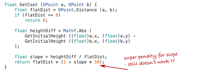
Then it hit me: My function just penalized the vertical distance, but it didn’t make any difference if this vertical distance came gradually or all at once.
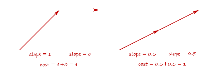
So in fact, my cost function wasn’t trying to avoid steepness - rather it was trying to make a path where the altitude changes monotonically. It would do everything it could to avoid the path first going up and then down again.
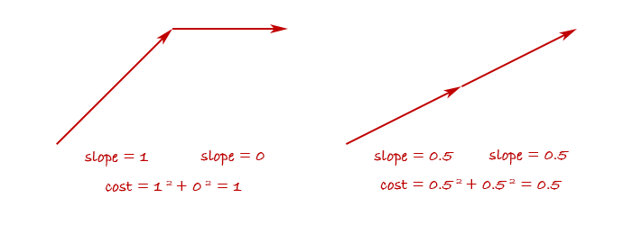
But I didn’t care if the path went a little up and down, as long as it wasn’t too steep at any point. To achieve this behavior, I needed to penalize steep slopes more than linearly, for example by squaring it.
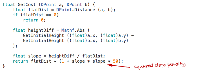
This has the effect of penalizing abrupt changes in altitude and reward gradual changes.
And sure enough, after the change the generated paths avoided steepness and looked much more like what humans would create.

Tweaking pathfinding cost functions is one of those odd little things that I really enjoy. Seeing a little change in a formula imbue a generated creation with what could be mistaken for human design is really fascinating and fun!
Further notes
The observation-turned-blog-post in its original form ended there, but I've compiled some further notes for those who want to dig into the details.
Pathfinding method
Let me tell about the method I use for the pathfinding, since I was asked about this. I won't do an introduction to pathfinding in general here but assume understanding of the principles of performing pathfinding using an algorithm like A* or similar on a graph of nodes connected by edges.
Such a graph can be represented in many ways. Sometimes it's a data structure with explicit data representing all the nodes and edges and how they're connected. Other times it can just be a grid (like a 2D array) and each cell is implicitly connected to the neighboring cells - maybe the 4 or 8 neighbors, depending on whether diagonal connections are used.
It doesn't really matter, and a pathfinding algorithm can typically easily be modified to work with one or the other. Apart from giving it a start node and goal node, the important part is that you can tell the algorithm:
- Which other nodes are a node connected to?
- What is the real or estimated cost of getting from one node to another?
You might have data for this stored in advance or you might calculate the answers on the fly when asked.
For the terrain pathfinding I do the latter. In fact, there is neither an explicit graph, nor any 2D array. There is no data structure at all for the pathfinding to happen inside. Instead, it's all implicit, based solely on coordinates. I tell the pathfinder what the start and end coordinates are, and there's a function for getting "neighbor coordinates" to a given coordinate. There's also a function for getting the cost of getting from one coordinate to another, as you saw earlier.
This may sound completely free-form and magical at first, but there still is a structure that must be adhered to. You must imagine a grid structure and ensure the coordinates always fall within this grid. In my case it's a plain quadratic cell grid where each cell has a size of 5. So the start coordinate, goal coordinate, and every provided neighbor coordinate must always have x and y values that are multiples of 5. You also shouldn't use floating-point numbers for this, since they can produce floating point precision errors, and even the slightest imprecision can cause the pathfinding to completely fail.
I wanted my paths to be able to have a natural, non-jagged look, so I wanted edges to come in 16 directions instead of the basic 8. The 8 additional directions are achieved by going two cells out and one to the side. This provided me with an interesting choice of whether the 8 other directions should also go two cells out, or just one.

In theory the second option can be weird, since if you need to move just one cell the path have to first side-step by two cells. But in practice both seems to work fine. The first images in this post were made with the first option but I later decided to use the second to avoid the path having very small-scale zig-zags.
Effects of different parameter values
I got asked on the proceduralgeneration sub-reddit:
How rapidly does the path change as you increase the power from 1.0 to 2.0? What happens if you go past 2.0? Does the path eventually have to spiral around the mountain or something?
I had actually been content just using the values I had found which seemed to work well enough, but now that I'd been asked, of course I wanted to find the answers too! I tried doing the pathfinding with the power values 1.5, 2.0 and 3.0 and with the multiplier values 1, 2, 3, 4, 5, 6, 7, 10, 15, 20, and 25. I had moved the multiplier inside the power function since the original version of the code, so those multipliers are multiplied onto the steepness before the resulting value is raised to the given power. Here's a table of the results.

Some notes on the result.
Overall the common theme is that the results range from straight and boring to wildly tortuous. At the extreme end, the path begins to create loops - something that should be impossible with path-finding. However, the edges I use in the path-finding can cross each other. This means that they can appear to loop even though they never pass through the same points from the perspective of the path-finding. They only begin to do this once the path-finding is so extremely sensitive to tiny changes in altitude that the small difference in altitude between one of two crossing edges is enough for it to exploit it to loop around. I should say that I only sample the altitude at the end-points of each edge, which appears to be fully sufficient except in the extreme cases like this.
Note that there are very similar occurrences across the different power values. For example, multiplier 10 at power 1.5 looks just like multiplier 6 at power 3.0, and multiplier 7 at power 2.0 looks just like multiplier 5 at power 3.0. Does this mean that any result you can get with one power value, you can also get with another? That there exists a transformation that means they're mathematically equivalent? No, I don't believe so. It feels like there's subtle differences. For example, the progression of paths with power value 3 begins to do loops before it begins to take a major detour, while for power value 2, the loops only start happening after it has begun doing a large detour. The differences are very subtle though and hard to put the finger on exactly.
One thing that's tempting to look for is qualitative differences, such as some paths doing many small zig-zags and others doing larger swoops. However, I think that's a red herring. The algorithms doesn't measure sharpness of turns or frequency of turns in any way and shouldn't be able to tell one from the other. I think that the seeming qualitative differences are thus up to unpredictable aspects of how the path-finding interacts with the terrain height function that sometimes just happen to produce one result or the other. To answer it in terms of the original question: If the terrain was perfectly conical, a path from the base to the top might equally well form a spiral, a zig-zag pattern, or any other combination of left-winding and right-winding sections.
My own pragmatic takeaway from this is that sticking with just a power value of 2 seems fine and I'd then use multiplier values between 3 and 15 depending on how straight or tortuous I want the path to be.
Perspectives
These generated paths were a proof-of-concept for a new project I'm working on and I'm sure I'll learn more as I go along. For example, already I'm learning some things about approaches for flattening the terrain around the paths which I may share at a later point when I'm a bit more sure of my findings. For now, I hope you found this useful!
2024 update: Code available
I've now released a framework called LayerProcGen as open source, and one of the sample scenes generates natural paths using the technique described in this article. So a fully functional implementation is now available for study and use.
The Cluster 2015 Retrospective
The Cluster is an exploration game I've been developing in my spare time for some time. You can see all posts about it here. It looks like I didn't write any posts about it for all of 2015, yet I've been far from idle.
By the end of 2014 I had done some ground work for fleshing out the structure of the world regions, but the game still didn't provide visible purpose and direction for the player.
My goal for 2015 was to get The Cluster in a state where it worked as a real game and I could hand it over to people to play it without needing instructions from me. Did The Cluster reach this goal in 2015? Yes and no.

I made a big to-do list with all the items needed to be done for this to work. (As always, the list was revised continuously.) I did manage to implement all these things so that the game in theory should be meaningfully playable. I consider that in itself a success and big milestone.
However, I performed a few play tests in the fall, and it revealed some issues. This was not really unexpected. I've developed games and play tested them before, and it always reveals issues and shows that things that were designed to be clearly understandable are not necessarily so. I don't consider this a failure as such - when I decided on my goal for 2015 I didn't make room for extensive iteration based on play test findings. I did manage to address some of the issues already - others will need to be addressed in 2016.
On the plus side, several players I had playing the game had a good time with it once they got into it with a little bit of help from me. In two instances they continued playing for much longer than I would have expected, and in one instance a play-tester completed clearing an entire region, which takes several hours. I think only a minority of players can get that engaged with the game in its current state, but it was still highly encouraging to see.
Essentials
Some boring but important stuff just had to be done. A main menu. A pause menu. Fading to black during loading and showing a progress bar. (I found out that estimating progress for procedural generation can be surprisingly tricky and involved. I now have a lot more understanding for unreliable progress bars in general.) Also, upgrading to Unity 5 and fixing some shaders etc.

Enemy combat
I had AI path-finding working long ago, but never wrapped up the AIs into fully functional enemies. In 2015 I implemented enemy bases in the world to give the enemies a place to spawn from and patrol around.

Enemy combat also entailed implementing health systems for player and enemies (with time-based healing for the player), implementing player death and reloading of state, and having the enemies be destroyed when the player enters certain safe zones.
For the combat I decided to return to a combat approach I used long ago where both player and enemies can hold only one piece of ammo at a time (a firestone). Once thrown, player or enemies have to look for a new firestone to pick up before they can attack again. This facilitates a gameplay alternating between attacking and evading. I noticed that the game Feist uses a similar approach (though the old version of my game that used this approach is much older than Feist).

I decided to begin to use behaviour trees for the high-level control of enemies. This included patrolling between points by default, spotting the player on sight, pursuing the player, but look for firestones on the ground to use as ammo if not already carrying one. Then returning to patrolling if having lost sight of the player for too long. Even AI logic as simple as this turned out to have quite some complexities and edge cases to handle.
Conveying the world structure
The other big task on my list after enemy combat was making the world structure comprehensible and functional to the player.
Worlds in The Cluster are divided into large regions. One region has a central village and multiple shrines. All of those function as safe zones that instantly destroys enemies when entered and saves the progress. In addition, a region has multiple artefact locations that are initially unknown and must be found and activated by the player. This basic structure was already in place by the end of 2014, but not yet communicated to the player in any way.
I've done my share of game design but I'm still not super experienced as a game designer. It took a lot of pondering and iteration to figure out how to effectively communicate everything that's needed to the player, and even then it's still far from perfect. In the end I've used several different ways to communicate the world structure that work in conjunction:
- Supporting it through the game mechanics.
- In-world as part of how the world looks.
- In meta communication, such as a map screen.
- Through text explanations / dialogue.
Supporting world structure through game mechanics
There are a number of game mechanics that are designed to support the world structure.
The artefacts that are hidden around the region can be discovered by chance by exploring randomly, but this can take quite a while and requires self-direction and determination that not all players have. To provide more of a direction, I introduced a mechanic that the shrines can reveal the approximate location of the nearest undiscovered artefact. This gives the player a smaller area to go towards and then search within.

In order to sustain most of the mystery for as long as possible, a new approximate artefact location can't be revealed until the existing one has been found. This also helps giving the player a single clear goal, they are still free to explore elsewhere if desired.
Once an artefact is found, a shortcut in the form of a travel tube can be used to quickly get back to a more central place in the region. Initially the tube exit would be close to a shrine, but the player might subsequently miss the shrine and be aimless about where to go next. Based on early play tests, I changed the tubes to lead directly back to a shrine. This way the player can immediately choose to have a new approximate artefact location revealed.

World structure communicated in-world
I got the idea to create in-world road signs that point towards nearby locations in the region, such as the village and the various shrines. This both concretely provides directions for the player and increases immersion.
Particularly for a procedurally generated world, the signage can also help reinforce the notion that there is structure and reason to the world as opposed to it being entirely random as can be a preconception about procedurally generated worlds.

This entailed generating names for the locations and figuring out which structures to store them in. The signs can point to locations which are far outside the range of the world that is currently loaded at the max planning level. As such, the names of locations need to be generated as part of the overall region planning rather than as part of the more detailed but shorter range planning of individual places.
Next, I needed to make key locations look their part. I'm not a modeller, but I created some simple placeholder models and structures which at least can give the idea of a village and shrines.


Improved map screen
I had created a detailed map for the game long ago, but that didn't effectively communicate the larger overall structure of a region.
To remedy this I created a new map that shows the region structure. I've gone a bit back and forth between how the two maps integrate, but eventually I've concluded that combining them in one view produces too much confusing simultaneous information, so they are now mostly separate, with the map screen transitioning between the two as the player zooms in or out.
Here's examples of the detail-map and the region-map:


Apart from the map itself, I also added icons to the map to indicate the various locations as well as the position of the player. Certain locations in the game can be known but not yet discovered. This mean the approximate location is known but not the exact position. These locations are marked with a question-mark in the icon and a dotted circle around it to indicate the area in which to search for the location.

Part of the work was also to keep track of discovered locations in the save system.
Dialogue system
Communicating structure and purpose through in-world signage and the map screen was not sufficient, so I started implementing a dialogue system in order to let characters in the game be able to explain things.

This too proved to be quite involved. Besides the system to just display text on screen in a nice way, there also needed to be a whole supporting system for controlling which dialogues should be shown where, depending on which kind of world state.
This can be complex enough for a manually designed game. For a procedural game, it's an additional concern how to design the code to place one-off dialogue triggers in among procedural algorithms that are used to generate hundreds of different places, without the code becoming cluttered in undesirable ways.
What's next?
I hope to get The Cluster into a state where it's fully playable without any instructions in the first quarter of 2016.
After that I want to expand on the gameplay to make it more engaging and more varied.
As part of that I anticipate that I may need to revert the graphics in the game to a simpler look for a while. I've had a certain satisfaction from developing the gameplay and graphics of the game in parallel, since having something nice to look at is very satisfying to accomplish. However, now that I'll need to ramp up rapid development of more gameplay elements, having to make new gameplay gizmos match the same level of graphics will slow down the iteration process. For that reason I'll probably make the game have more of a prototype look for a while, where I can develop new gameplay with little or no time spent on graphics and looks.
Nevertheless, even with a much simpler look, I still want to retain some level of atmosphere, since one of the things I want to implement is more variety in moods. This is in extension to the game jam project A Study in Composition I worked on this year.
If you are interested in being a play tester for early builds of The Cluster, let me know. I can't say when I will start the next round of play testing, but I'm building up a list of people I can contact once the time is right. Play testing may involve talking and screen-sharing over e.g. Skype since I'll need to be able to observe the play session.
If you want to follow the development of the Cluster you can follow The Cluster on Twitter or follow myself.
A Study in Composition
Two weeks ago I participated in Exile Game Jam - a cosy jam located remotely an hour's drive outside of Copenhagen. There was a suggested theme of "non-game" this year.
This was partially overlapping with the online Procedural Generation Jam (#procjam) which ran throughout last week with the simple theme of "Make something that makes something".
I wanted to make a combined entry for both jams. My idea was to create procedural landscapes with a focus on evoking a wide variety of moods with simple means. I formed a team with Morten Nobel-Jørgensen and got an offer to help with soundscapes from Andreas Frostholm, and we got to work.
You can download the final result here: A Study in Composition at itch.io. You can also watch a video of it here:
Furthermore we decided to make the source code open source under the MIT license. You can see and download the Unity project folder at GitHub.
Motivation
The motivation of the project was primarily to learn about how to create evocative and striking landscapes with simple means, particularly by creating harmonic and expressive color palettes. The name "A Study in Composition" is meant to convey this in a similar sense as it's used in classical art.

Making the demo
Each scene consists of just a flat plane and a distribution of trees, all of it with simple colors without textures. Additionally there is a light source, variable fog amount, and sometimes a star-field. The trees are procedurally generated using L-systems and are distributed in many different ways using multiple noise functions.
Tree generation
Morten had created procedural trees with L-systems for previous work that we could make use of in this project. This was a huge head-start. During the project he worked on improvements such as support for leaves, a simple wind effect, and improvements to the algorithm.
Distribution of trees
We use a continuous noise function to distribute the trees. The function is evaluated twice - once at low frequency and once at higher frequency - and the values (between 0 and 1) are multiplied together. Simply put, this creates large clumps consisting of smaller clumps.

The resulting function is still between 0 and 1. For each position in a grid, we evaluate the function. The the function value is greater than a certain threshold, we place a tree.
The threshold value is different from scene to scene. We also add a random value to the threshold for each tree placement to make the edges of the clumps of trees more fuzzy. This randomness amount is also different from scene to scene. The result can create anything from dense forests to sparse savannas, and within a single scene, trees are not uniformly placed but clumps nicely in groups.
Color palettes
An important element of evoking different moods despite the simple means is in the color selection. First an initial color is chosen. This is done is HSV color space, where hue, saturation, and value are all values between 0 and 1. (The Value in HSV means brightness; not to be confused with lightness.)
A palette is created from the initial color by creating either a pair of complementary colors from it, or a color triad. The initial color determines the saturation and value of all the colors in the palette. This is a simple way to make the palette look consistent and harmonic.

Some extra color variations are created, and each scene element is then assigned a color from this palette. Each element knows its "normal" color and will attempt to choose a color from the palette similar to that. This will often result in natural landscapes with green grass, blue sky, brown branches, and green to red leaves. Sometimes though, nothing close to those colors will be available in the palette, and the result may be more surrealistic.
One thing I found during development was that palettes with low value (brightness) and high saturation always seemed to look bad. While I don't know for sure, my theory is that it's related to night vision. In our demo, a dark palette makes everything darker, including the sky, so it's synonymous with a darker light level, meaning dusk, overcast, or night time environments. In low-light environments, the color vision ability of the human eye becomes less effective, and the night vision ability - which is in gray-scale only - plays a larger role. So I think there's an expectation that low light environments don't have saturated colors, since our color vision is mostly out of play.

In any case, to avoid the unpleasant looking saturated dark colors, we simply multiplied the value (brightness) onto the saturation.
Soundscapes
Two thirds into the development, we showed the demo to Andreas who were making sounds for other jam projects too. In a short amount of time he managed to bang out soundscapes that added a lot of atmosphere to the demo while having zero constraints on how they should be played. The multiple pieces of sound files had different length but were each either non-rhythmical or only sporadically rhythmic, and they could be played on top of each other randomly and still sound good. The result is not always harmonic, but it intentionally uses the disharmony to create hypnotic soundscapes that interweaves between beautiful calm and eerie.
The sound files sounded fine all just playing simultaneously at the same value, but I added some extra variety by randomly adjusting the volume levels.
Cinematography
During development of the demo, I got tired of walking around manually using a first-person view, and pressing a button to change the environment. It seemed unnecessary to what we were doing, so we decided to make the camera movement and scene changes automatic instead. Non-games were encouraged and fully accepted in the two jams respectively anyway.
For camera movement we initially had a camera zooming fast by the trees, but following a tip from Tim Garbos to slow it down a lot made the scenes come much more to their right. Late in the process we settled on some variations of camera movement: Successive shots would vary between moving the camera forward or panning sideways left or right. It would also vary between being position at eye height (most common) or above the trees for a grander overview (more seldom).
We experimented with different ways of fading between shots. A cross-fade was impractical due to the need to have two scenes active at the same time, but we tried fading to black or white. Frequent fading detracted from the experience though. In the end we used no-frill cuts, but had every third cut be bridged by a dramatic cut to black inspired by the opening to Vanilla Sky. I joked that we should win the award for pretentiousness if the jam had one.
Some tweaks were made after the Exile Jam was over, while ProcJam was still running. I made the groups of three scenes in between black cuts thematically coherent by keeping certain variables constant between them. While most variables are randomized in every new scene, the palette saturation and value, the fog amount, and the camera movement mode is only changed when a "black cut" happens. This lets you experience small variations of a theme with the black cuts resetting the senses in between changes to new themes.
Future work
While there is a lot of ways the demo could be expanded and improved, we don't have any future work planned for this demo in itself. For me, I'm going to use what I've learned about creating variety in environments for my own other procedural projects.
We've also made the source code for this demo available and if you do anything with it, we'd love to hear about it!
Procedural worlds: The simulation, functional and planning approaches
Procedural generation has gotten a lot more popular since my interest in it started 10 years ago. Today most game developers and even many gamers know what it means in broad terms.
In this piece I want to highlight fundamental differences between three approaches to procedural world generation: The simulation approach, the functional approach and the planning approach. The approaches are not only algorithmically very different but are also suitable for different types of games and gameplay. Here's a breakdown and analysis, with lovingly hand-drawn - err, mouse-drawn - illustrations.
The three approaches
The simulation approach attempts to create an environment by simulating the processes that creates it. Terrain erosion, vegetation distribution based on plants competing over sunlight and nutrients, fluid dynamics, fire propagation and genetic algorithms all fall under this approach. Simulation approaches are not always based on reality. For example cellular automata simulations can be used to create nice cave patterns even though this is not mimicking how caves are formed in reality. The defining trait of simulations is that it's a process with calculation steps that are repeated many times in order to reach the end result.

The functional approach deals only with the desired end result and attempts to approximate it directly with a mathematical function. For height field based terrain, this could be using a Perlin Noise function, a fractal function, or any combination of many different functions to determine the height for a given coordinate. Similar functions (but for 3D coordinates) can be used for voxel terrain. For vegetation, mathematical functions can be used to determine the probabilities for various types of plants to appear at a given spot.

The planning approach doesn't primarily try to mimic nature at all, but instead plans out an area according to level design principles. For a terrain it might create a mountain range that can only be passed in a specific spot, or it could carve out a cave which contains a key inside that unlocks a vital door elsewhere. For vegetation it might create dense trees that block the player from taking an unwanted shortcut, or it might place plants and flowers in specific spots to try to create a certain emotion or feel related to that spot.

We'll get back to the planning approach in a bit. For now, let's compare the simulation and functional approaches.
Context or no context
An important distinction of the functional approach is that the value at a given coordinate can be evaluated without regard for neighboring points. This is both a strength and a weakness.
The strength is that the generation is simpler and that it can more easily be divided up into smaller parts that don't rely on each other. No arrays need to be used for the generation except to store the end result and this means lower memory requirements.
For games with a pseudo-infinite world, such as Minecraft and No Man's Sky, the lack of dependencies on neighboring points (at least for terrain generation) is important. Since the world is generated in chunks on the fly, a point may need to be evaluated without the neighboring points being available yet, because they are in a different chunk that doesn't exist at this point in time.

The weakness of the functional approach is that certain things can just not be calculated meaningfully without context. For example, consider a river that flows from a source and downwards wherever the terrain goes down the steepest. Given a mathematical function that defines a terrain, it's not generally possible to determine where the river would flow without considering the terrain at many different points at once. Similarly, it's not possible to calculate how light and shadow propagates in a space without having the context of the surrounding geometry available.
There are ways to get around these limitations by mixing functional techniques with simulation techniques. Once a pass of functional calculations have run, a different pass of simulation can run on top, which has does context information. For game worlds that are not generated all at once - and that includes all pseudo-infinite worlds - this has to be handled very carefully to work correctly.
One example is calculation of lighting in Minecraft. The terrain is calculated fully functionally (with user-created modifications on top). After that, the lighting is simulated with proper context information about the terrain. However, the fact that the lighting simulation needs context means that lighting near the edge of a chunk needs terrain data from the neighboring chunk in order to be simulated. How far out can a change in geometry affect the lighting? 2 blocks? 10 blocks? 100 blocks? This, along with the block size of chunks, affects how many neighboring chunks must have been "geometry calculated" before a given chunk can be "lighting simulated".
It just so happens that chunks in Minecraft are 16x16 (vertically they take up the entire world height), while lighting propagates only 15 blocks. This conveniently means that only the 8 neighboring chunks need to be geometry calculated in order for sufficient lighting context to be available for a chunk. This is very likely not to be a coincidence. Having light propagate further than the size of one chunk would have had large negative consequences for the performance.

(Disclaimer: My explanation of lighting in Minecraft is based on a few facts combined with speculation on my part. I can't guarantee it actually works the way I describe but it's entirely conceivable.)
Other types of simulation can not as easily be limited to a specific range. One option here is to just ignore the simulation for chunks or parts of the world that haven't been generated yet, and just simulates the best they can with the information generated so far. Maybe a river only begins flowing once the player gets close enough to its source that the chunk containing the source is generated, and that's okay. But for other games where any rivers present should appear to have always been there and not just suddenly begin flowing based on player location, it can be a tricky or impossible problem to solve.
Topology and traversability
Consider for a moment a game with a player character that can not dig holes or build structures (except maybe at very specific spots). It could be Zelda, Grand Theft Auto, Mario, Half-Life, Metroid or really most other games. What would it mean if there was a hole too deep to jump out of? A gap too wide to jump over? Or a tall wall with a vital objective on the other side but no way to get past it? Basically you would be stuck. It would be game breaking.

Games like Minecraft would have tons of these stuck situations if it wasn't for the ability to dig and build. But in the majority of games - games where the player can generally not modify the environment much - the level design needs to guarantee that you won't get physically stuck with no means to progress.
These games need to guarantee that the topology is such that it can be traversed by the player, so that all locations can be reached that needs to be reached.
Here's the kicker: Neither the simulation nor the functional approach can make such guarantees. (Well except in boring cases; for example if the world is so flat and without obstructions that the player can go in any direction at any time.)
Let's say we uneven terrain with caves. The simulation and functional approaches can easily be used to create interesting terrain of this type, but very little can be guaranteed about it. Maybe it creates some cliffs, but you don't know if you can get to the top, or if it's too steep all the way around. Or maybe it creates a cave underground, but you don't actually know if it's connected to the surface or not.

For the functional approach, this is because it evaluates every point without context - and topology cannot be determined without context. Again, the exception is terrain where it's trivial to get to any point, but that's not useful for directed, non-sandbox gameplay. The point is that it's virtually impossible to create a mathematical function that creates interesting level/world design where it's non-trivial to reach a given goal location, yet still guaranteed to be possible. Maybe it's doable - and if so that would be highly interesting - but I've yet to have seen it pulled off in practice.
For the simulation approach, the context is usually available, but simulation is not concerned with making guarantees about topology or traversability, just like there are no such guarantees in nature. If a simulation algorithm did make such guarantees, it would really at least partially be a planning algorithm instead.
The planning approach then is the one that can make these guarantees. In fact, much of the planning in planning algorithms is typically centered around ensuring such guarantees.
If you have read articles describing procedural generation for rogue-like games, they typically describe how multiple rooms are placed on the map, and an algorithm ensures that they are all connected with passages. Maybe certain rooms are guaranteed to only be reachable via one passage. More advanced ones may have keys for locked doors, and need to ensure that a key for a locked door is not placed behind the locked door, and similar.

Most games with planning algorithms take place in sequences of maps with limited size, which each are generated all at once. It's trickier, though absolutely possible, to use the planning approach on pseudo-infinite worlds generated on the fly in chunks. It typically requires planning at several scopes, with a large-scale planning algorithm handling the overall design of the world. This algorithm can then delegate responsibility of the more fine grained planning to algorithms creating the individual chunks. Often, each chunk is given certain criteria it must meet in order to fit into the overall plan. There can be an arbitrary number of such layers of responsibility.
I'm not aware of any shipped games that are pseudo-infinite and use the planning approach - let me know if you do! My own game in development, The Cluster, uses this approach, and I write about various aspects of the generation and design on my blog.
Generation approaches and effects on gameplay
We have discussed how the simulation and functional generation approaches cannot make guarantees about topology and traversability. What this means is that they are essentially mostly suited for games with sandbox gameplay, for example where the player can dig and/or builds anywhere in order to make non-traversable environments traversable. Often these games also don't have any specific locations that must be reached, with the goals being loosely defined or completely absent.
More traditional "directed" games have carefully constructed level design that can be traversed without freely modifying the environment. For these games certain guarantees must be made. For this to be done procedurally, a planning approach must be used.
We have also discussed the implications for pseudo-infinite games that are generated in chunks on the fly. For these games the functional approach has very advantageous properties in that it doesn't require context. The simulation approach can be used only to a very limited extent, while the planning approach can be used fine, but needs very careful division of responsibility between different generation algorithms at different layers of scope or abstraction.
Mixing and matching
While a procedural game typically has one approach that dominates its generation strategy, there's no problem in mixing and matching the different approaches. For example, a game might use a planning approach for the overall level design, use a bit of simulation to enhance aesthetic properties of the terrain that doesn't affect traversability, and then use a functional approach to place vegetation.

The dominating approach could be said to be the one that affects gameplay the most, and specifically determines how the player can move around in the world and achieve objectives. For anything that doesn't affect gameplay directly, or only in aesthetic ways, the choice of approach is more of an open question.
I hope this article has been helpful in giving insight into various approaches to use for procedural world generation, either for analyzing other games or for use in designing your own. If you have great examples of games using the various approaches to good effect, let me know!
Revised web design
In the past few weeks I've been implementing incremental changes to the design of my website. Generally I still like the overall aesthetic and layout of the design made in 2008, but I wanted to tweak it to bring it more in line with modern web design ideals.
Here's the new design next to the old:


The goal has been to move the design more in the direction of minimalism (not that I've striving for absolute minimalism) and to make the layout responsive so it works better on mobile devices and can take better advantage of wider screens.
Minimalism
There has long been a trend in web design, and in recent years in application design too, towards minimalism in UI aesthetics. The reasoning goes that the content should be the primary focus with little else to distract from it. This has often been implemented in the form of flat designs. Though ubiquitous today, flat redesigns have sometimes been controversial, especially when used in applications, and when taken to an extreme. I have certain reservations myself, but that's a discussion for another time.
In any case, minimalism certainly have some merit to it. Since all the texture and shading in my old web design was purely cosmetic and wasn't used for aiding usability, I could see the point in getting rid of some of that to produce a cleaner design.
I've worked with a process of implementing the low hanging fruit first. Just removing the background pattern and the background spark image already made the design feel a bit more clean, but it left an awkward empty gap to the left of the title. I didn't want to move the menu sidebar upwards, but placing the menu sidebars at the right side instead of left fixed the problem, and has been a general trend for a long time anyway.

Next step was trying out getting rid of the shading. To begin with I simply replaced the shaded graphics files with flat versions to be able to test it without touching the HTML and CSS - well, except for changing the colors of the box headers and timestamps.
For a long time I had disliked the headers being confined to thin colored bars, so I wanted to get rid of that at the same time.

This change basically took the graphical look 90% of the way, but as everyone knows, the devil is in the details, and there was still many small tweaks needed.
What came next though were not more visual design changes but rather technical changes to the implementation.
Modern styling and responsiveness
Now that the general flat look was validated, I could proceed to implement it in a smarter way. Modern CSS can draw rounded borders fine without any image files needed. This required quite some changes to the HTML and CSS. Most of it was removing a lot of cruft of nested divs that used to control the image-based borders, but some rethinking of the margin and padding values was also required.
Before I could begin implementing responsiveness, I also needed the header to be horizontally resizable. The header was one big image, which made resizing tricky. In order to make it resizable, I split it up into multiple parts: One background image for the box itself, one semi-transparent image with the portrait and left side text, and one semi-transparent image with the site name. Now I could make a resizable box in CSS with the new background image as background, rounded corners handled by the browser, and additional image elements layered on top.
With all boxes now being resizable, I could implement media queries to support multiple layouts of the site suited for different screen resolutions. The original design was designed for a minimum browser width of 800 pixels. I kept that one since it's still good for old monitors, browsers that are not full-screen, and now also for tablets. I added a wider but otherwise identical version for wider screens. Finally, I added a narrower version suitable for mobile browsing.


The mobile layout is significantly different from the others. The menu sidebars are absent since there's no room, and the header doesn't have links for each main section in the orange bar. All the text is also larger.
Text scaling in CSS
For a long time I was seriously confused at the results I got when trying to scale all the text up or down, especially in how it interacted with line height. The best practices I arrived at is:
Use rem unit for font sizes
Use not %, pt, px, or em for specifying text sizes, but rather the new unit rem (root em). Probably obviously, px and pt are not suitable for scaling at all since they're absolute units. What's more tricky is that % and em are not easy to use for specifying sizes either. Since they specify sizes relative to the parent element, font sizes can end up being affected in non-trivial ways by the amount of nested elements the text is inside. By contract, the rem unit is not relative to the parent, but to the root element (the html tag), so nested elements have no effect on font sizes. Still, the overall scaling of all text can be controlled by setting a % font size in the style for the html element. My mobile layout has font-size: 140% for the html element.
Use unit-less numbers for line height
Line height should be specified using numbers with no units, except for exotic use cases where you want the same distance between lines regardless of font size. For a long time I assumed line height should be specified in either % or em, but that will calculate the physical line height in the context of the element it's specified for, and nested elements will then inherit that physical line height regardless of whether they use a smaller or larger font. Specifying the line height as a number with no unit prevents that.
I still have some confusion left over how some mobile browsers (such as iOS Safari) scales text up in ways that are inconsistent or ill-explained, but it's not a big issue.
Mobile menu
There's no room for the sidebar menus in the mobile layout, so I opted for a drop-down menu instead. The menu is expanded and collapsed using jQuery (no surprises there).

Viewport logic
Modern browsers can scale pages arbitrarily, and mobile browsers scale them all the time by default. When a page can be scaled arbitrarily up or down, the question is how much room it should have available. Mobile browsers let pages decide that using the viewport meta information, where the width and height of the viewport can be specified.
The viewport width and height can be set to either constant values, or set to certain variables such as the device-width. The problem is that this doesn't always provide enough control.
In my responsive design, the minimum (mobile) width layout fits 600 pixels and the narrow layout fits 800 pixels. There is no reason a mobile or tablet browser should use a viewport of a different width than either 600 or 800 - it would just be wasted space.
To use the space optimally, I used JavaScript to query the device width, and set it to either 600 or 800 depending on the current screen width. You'd think it should choose the 800 width version only if the screen is at least 800 pixels wide, but that's not actually the intended behavior. Instead it chooses the 800 version of the screen is at least 480 pixels wide, otherwise the 600 version. You see, even for a screen with only 480 pixels width, it works better to use the 800 version scaled down than using the 600 version (scaled down less). Like I said, pages can be scaled arbitrarily, and there's no reason that a 1:1 scale is necessarily the optimum to strive for.
Why use exactly 480 to determine whether to use the 600 or 800 version? Well, supposedly that's about the size that divides the phones from the tablets (in most cases), and I want the 600 mobile-optimized version to be used for phones only; not tablets.
I'm sure this simple logic doesn't cover all cases, but it "works for me" (tested on iPhone 5, iPad retina and Nexus 7) and should be good enough for my personal site.
Going forward
So far I'm happy with the revised design, though I'm sure there's still many things that could be improved. For example, I didn't look into using more modern fonts at all; it's still using "good old" Verdana/Arial. I also haven't gone through all the old content on my site and made sure everything looks good and isn't broken. Let me know if you spot any issues.
Generally my experience getting re-acquainted with HTML / CSS is that it's become a lot nicer to use in the past half decade since I did the original design. Fewer hacks are needed and stuff feels more consistent.
That said, I still find many things in the layout model annoying, and by fewer hacks I definitely didn't mean no hacks at all. I keep Googling for solutions to simple problems and find only partial, yet overly complicated solutions. One issue I didn't solve yet is that boxes with no multi-line paragraphs don't expand to the full available width (like on this or this page). Don't think it's simply a matter of setting width: 100%, oh no, that will expand it beyond the available width (because of the silly CSS box model where box sizes excludes padding and borders)...
Beyond that, is there any low-hanging fruit I've missed? Some further big improvements I could implement with little effort? If you have any tips, let me know.